"Storm Prototype No.4," 2006, Iñigo Manglano-Ovalle. Fiberglass and aluminum alloy foil. Image courtesy of the artist. ©Storm Prototype No. 4, Iñigo Manglano-Ovalle.
Seeing the Unseeable: Intersections in Data, Science, Art, and Design
Sep
19
2024
Feb
15
2025
Picturing Science

A Curatorial Perspective on Two Objects

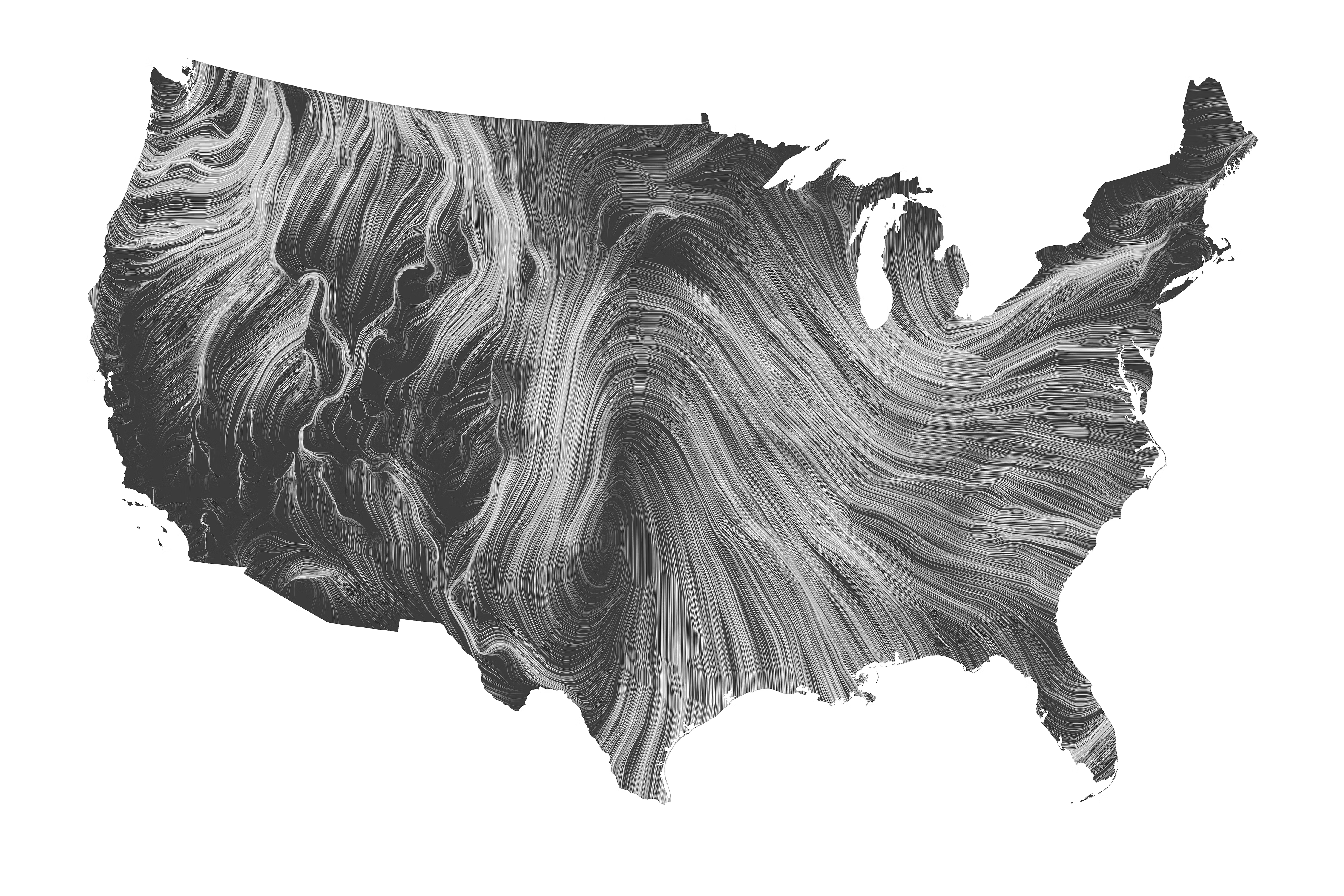
These two works exemplify the diversity of approach to visually expressing data. Data visualization scientists and designers Fernanda Viégas and Martin Wattenberg created the Wind Map to convey real-time wind data in an aesthetically pleasing way. The purpose of the map is to present an image in service to useable data. Storm Prototype No. 4, by artist Iñigo Manglano-Ovalle, conveys sculpture that is created with data (the form is a model of 3D data of thunderclouds). While it is not useable data in the practical sense, the work transcends the issue of climate change and natural weather phenomenon to capture the experience and feel of these immense forms that hover over land. Both works are informed by data in creating an aesthetic experience and overlap in being considered as aesthetic objects. However, the artists and designers convey data in very different ways.

Exhibition page.

ArtCenter College of Design

1700 Lida Street, Pasadena

WED-SAT:12-5PM

Black-and-white map of the United State, displaying a visualization of wind patterns similar to the swirls on marble.
"Wind Map," Visualization of wind patterns in the US on November 2, 2013, Fernanda Viégas and Martin Wattenberg. Courtesy of Fernanda Viégas and Martin Wattenberg. ©Fernanda Viégas and Martin Wattenberg.
"Storm Prototype No.4," 2006, Iñigo Manglano-Ovalle. Fiberglass and aluminum alloy foil. Image courtesy of the artist. ©Storm Prototype No. 4, Iñigo Manglano-Ovalle.

Discussion Questions

  • What does it mean to live in the age of Big Data? How has it permeated into our cultural moment?

  • Does your data generate a story? What can data visually look like?

  • How would seeing data beyond numbers and charts change or alter the way we understand this medium?

  • Artists in this exhibition highlight the power dynamics of data when it is seen or unseen (invisible.) What would be considered as invisible data and what are the implications of it not being seen?

Bibliographic References

Viégas, Fernanda and Wattenberg, Martin. "Wind Map." real time.http://hint.fm/projects/wind/
Viégas, Fernanda and Wattenberg, Martin. "Design and Redesign in Data Visualization," first published in Malofiej 22, Annual Book. March 27, 2015https://medium.com/@hint_fm/design-and-redesign-4ab77206cf9
Art21.org. "Interview: Climate, Iñigo Manglano-Ovalle." First published on PBS.org, September 2007. Republished Art21.org, November 2011https://art21.org/read/inigo-manglano-ovalle-climate/
Min, Sey. "Data visualization design and the art of depicting reality." Last modified December 10, 2015https://www.moma.org/explore/inside_out/2015/12/10/data-visualization-design-and-the-art-of-depicting-reality/